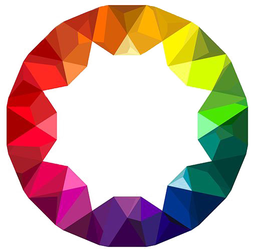
The psychology of colour - why are so many websites blue?

Colour plays a major part in web design. Not only must sites look good and have clear navigation but they must also hold the attention and direct the user to the site owner's goal.
Every colour has a strong psychological effect in design. We all know that red is stimulating, pink is youthful and feminine, green implies freshness and calm but why do so many sites use blue as the main colour? Think of Facebook, Digg, Twitter, Skype, LinkedIn and major brands such as Philips, Nokia, Fox News, HP and SkyTV.
A few facts:
- Over 40 percent of people worldwide picked blue as their favorite colour
- Blue is gender neutral. Studies show that men prefer darker and blue-green blues whereas women pick reddish-purple hues
- Blue implies trust, reliability and professionalism - which is why it appears so frequently in corporate colour schemes, the Police and governments
- Blue represents what people want. It’s synonymous with technology and innovation (think of Telecom) as well of what attracts users in a website: security, precision, stability, creativity and loyalty
In short, people just respond more favorably to blue allowing a more open-minded and trusting attitude towards advertising, brands and products. It works as simply as red does at getting our attention - which is why STOP signs are red.